[ad_1]

Measuring manufacturing growth
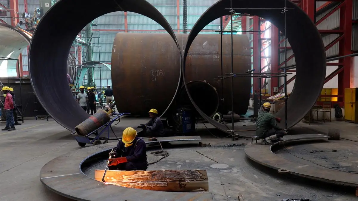
| Photo Credit:
AMIT DAVE
A high frequency indicator watched closely by the market is the Purchasing Managers Index (PMI) for manufacturing. It tells us about whether the manufacturing sector is doing well or not and hence considered to be a quick indicator of industry performance. It is based on a survey of around 400 companies where they are asked if conditions are better than they were in the previous month.
Five indicators are queried which include new orders, production, employment, delivery times and stocks. Based on the responses — yes, no and no change, — a diffusion index is calculated which lies between 0 and 100. Intuitively a reading above 50 signifies growth and below 50 reveals contraction.
The question is whether the PMI-M can be taken to be an indicator of manufacturing growth as the two are often taken to be synonymous. There is a reason to link the two as both are dealing with industrial output.
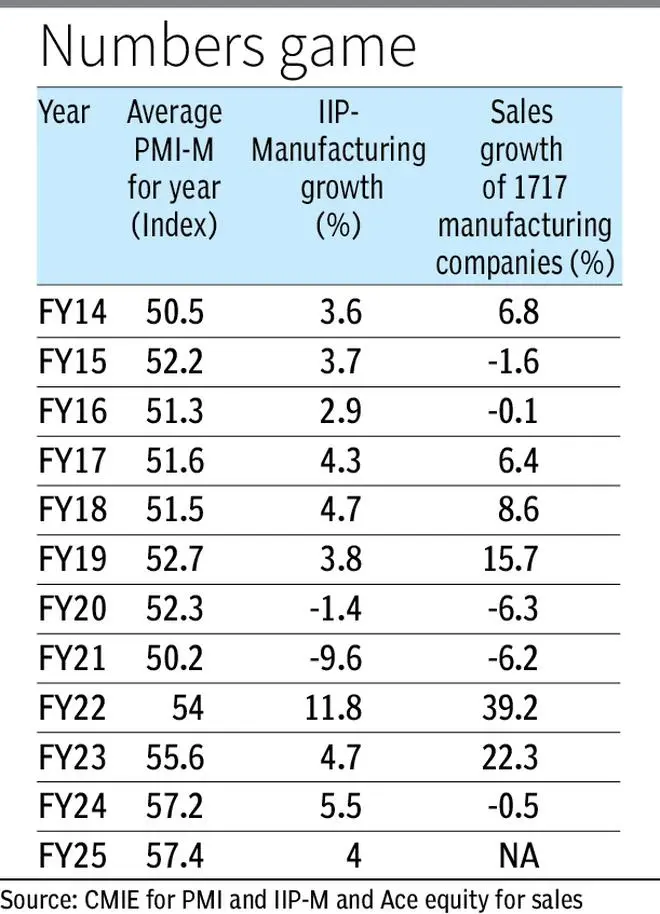
However, conceptual issues could lead to differing conclusions when the data on the two variables are juxtaposed. The table below provides data on growth in manufacturing as per the IIP along with the PMI-M for the year which is an average of the 12 months reported. Alongside is also given the growth in sales of a set of around 1,700 companies in the manufacturing sector.
Positive PMI
The PMI-M has always averaged above 50 in the last 10 years or so, signifying that there has always been an increase in output. Some months have exhibited a reading below 50 which was the case during Covid where four successive months were low and another one in the second episode in 2021.
Otherwise, the indices have been positive and for the year have always averaged above 50. This is where there are interpretation issues as any number above 50 means that output is better than the last reference period at the macro level.
IIP-M growth was in a narrow range of 3.6-5.5 per cent during this entire period if the extreme values during Covid and post Covid are excluded. In contrast, the PMI-M was always above 50.
Therefore optimism shown in PMI movements did not in general get reflected in higher manufacturing growth numbers.
Further, in FY20 and FY21 the IIP-M witnessed negative growth but the PMI-M was above 50 though FY21 did show a dip from 52.3 to 50.2. In the last three years, the PMI has been increasing. But the IIP-M was between 4-5.5 per cent and was lower than the previous year in two out of three years.
Overall in terms of direction change the PMI does reasonably well. In seven out of 11 years the PMI did show that the IIP-M moved in a similar direction though the magnitude was very different. This means that the PMI does well in terms of direction more often but does not really say much about the quantum of change that one can see in manufacturing output. In a way the PMI is agnostic to an increase being from 4 per cent to 4.1 per cent or 4 per cent to 10 per cent.
To get a further idea of the PMI correlating with business activity, the growth in sales of a random sample of 1,700 odd companies in the manufacturing sector has been juxtaposed in the table. Here too a similar picture emerges where in six of the 10 years, the direction of movement in growth in sales is in consonance with the movement in PMI-M. In FY25, it would tend to be higher which will yield a similar ratio of seven out of 11.
Why they diverge
This calls for an explanation. First, the sample used by the PMI is a niche one at 400 compared with IIP which covers a much wider set of units as well as commodities as it refers to the entire economy. Besides, the IIP also covers some part of the unorganised sector. Further the PMI sample would tend to be the larger companies which are also likely to be the better performing ones and hence may have an upward bias.
Second, the respondents give a response either in the affirmative or negative, but do not give any numbers. Hence an output increase could be either 1 per cent or 10 per cent. So one cannot relate any improvement in the PMI to quantitative changes as such. It is more of a directional clue being provided.
Third, the comparison is made over the previous month while the IIP-M is a comparison over the previous year. Seasonality is accounted for by the PMI while the IIP is a plain vanilla comparison over the previous year. This is probably the most important difference in concepts as both sales and IIP reckon growth rates over the year.
Fourth, the PMI data is normally out by the 1st of the month which means the data would have been collected before the month ends and hence probably based more on perception.
Having high frequency indicators is useful because in their absence it is hard to gauge the pulse of the economy or a sector. There are limitations as can be seen in the case of the PMI where the conclusion could be right 6-7 times out of 10 in terms of direction, though the magnitude is not really indicated.
This is also an issue when the GST collections are looked at, as often high collections do lead to the inference that consumption has picked up. But this may not always be the case as seen in FY25 where there were issues in urban consumption even while GST collections were robust.
The writer is Chief Economist, Bank of Baroda. Views expressed are personal
Published on May 7, 2025
[ad_2]
Source link